Blog Posts
Flexbox Magic: An Easy Way To Make Side-By-Side Images
August 25, 2025
Pictures taken in Iceland by me
While developing the websites for my blog and non-profit organization CodeForward, I envisioned a layout where multiple images could be displayed neatly side by side. This clean, organized presentation not only enhances visual appeal but also improves the overall user experience. However, I quickly realized that achieving this layout in an organized manner was more challenging than expected.
HTML's img tag on the surface can only do so much when it comes to formatting and displaying images. However, it is CSS that can unlock its true potential. As a result, by using flexbox, a type of layout, I was able to contruct side-by-side images in an organized and effiecient way. However, flexbox is not the only method the grid layout can also be used, though it is mainly used for other designs.
How Do I Utilize Flexbox?
In order to utilize what flexbox has to offer, knowing what it is used for is important. CSS's flexbox is a responsive and flexible layout that is used in containers. For images, it allows for easy control over them and allows for easy alignment. One drawback of Flexbox is that it is only able to make a 1 dimensional grid meaning that the items are either aligned as columns or rows. With this understanding, anyone is able to fully unleash the power of flexbox, creating captivating image layouts that are both flexible and responsive.
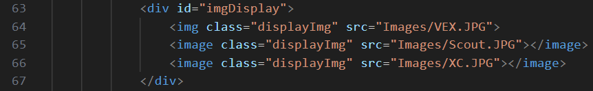
The HTML structure of Flexbox: place your elements within a parent container-usually one with a <div>tag and a class
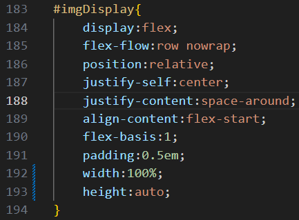
The CSS Styling: Apply the Flexbox property to the parent container
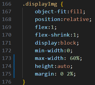
Applying the CSS to the Child Elements
Key Properties Used:
1. display: flex - This turns the parent container into a flex container, creating a flexbox layout, while its direct children become flex items;
-
2. justify-content: space-around - makes the space between each item the same. Some other useful values are space-evenly (spaces the objects evenly across the entire container, edges included) and space between (adds an even amount of space between the items while aligning the elements at the start and end with the edges of the container)
-
3. flex: 1 - makes the item take up the same amount of space as other objects. Flex: 2 would make the it take up twice the amount of space. This feature allows more organized images.
My Takeaway
Despite Flexbox's versatility, there are some situations that make it unwieldy to use. Such as 2d grid layouts, which CSS grid, fittingly named, outperforms Flexbox. Additionally, flexbox is a somewhat confusing thing to learn. In fact, it took me some time to understand each value and property of it. But web develop, in my opinion, is all about experimentation. So with enough time and effort, I was able to understand how it worked. Thus, allowing for my future uses of this feature to go by more smoothly.